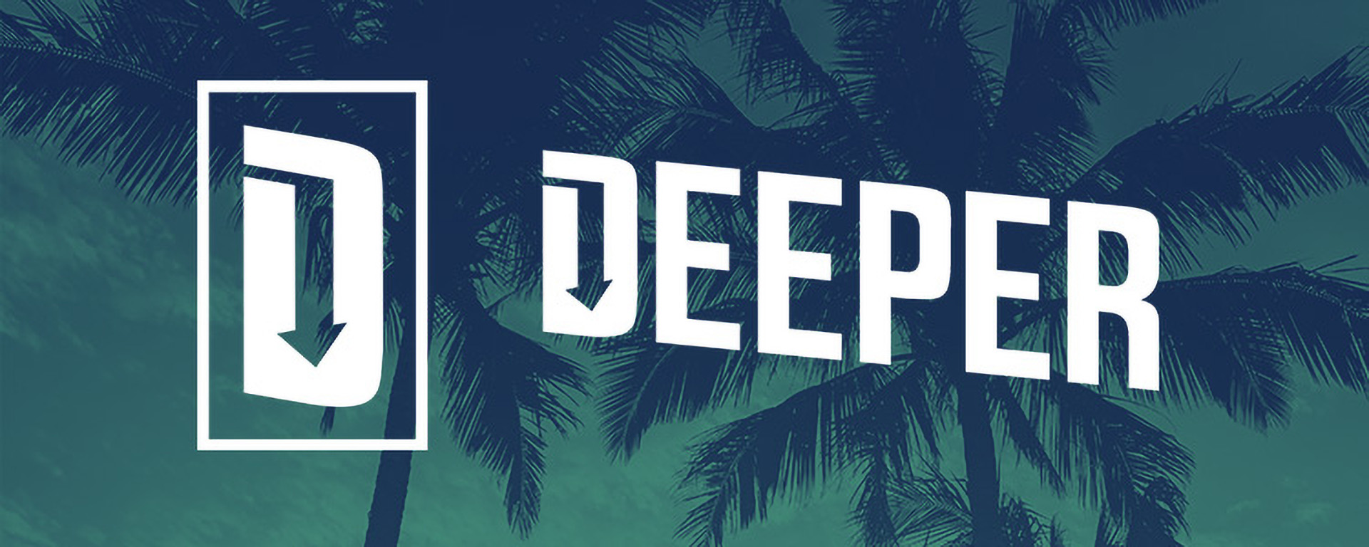
The Deeper brand identity was a pro-bono project I took on in support of a student ministry in the Panama City Beach area.
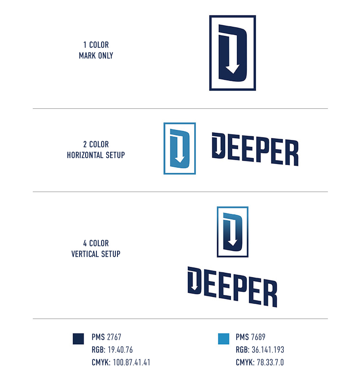
I wanted to make sure the branding was flexible, able to be displayed as a standalone Mark, or vertical/horizontal Mark + Logo Type, in 4-color, 2-color, and 1-color variations.
It was also very important to me that the Mark connected with the overall message of the ministry. First drafts of the logo had only a downward arrow, in place of the counter inside the D. The final version added a space connecting the negative space surrounding the D to the downward arrow, which lets the logo contain a visible representation of a path leading to a drop-off.
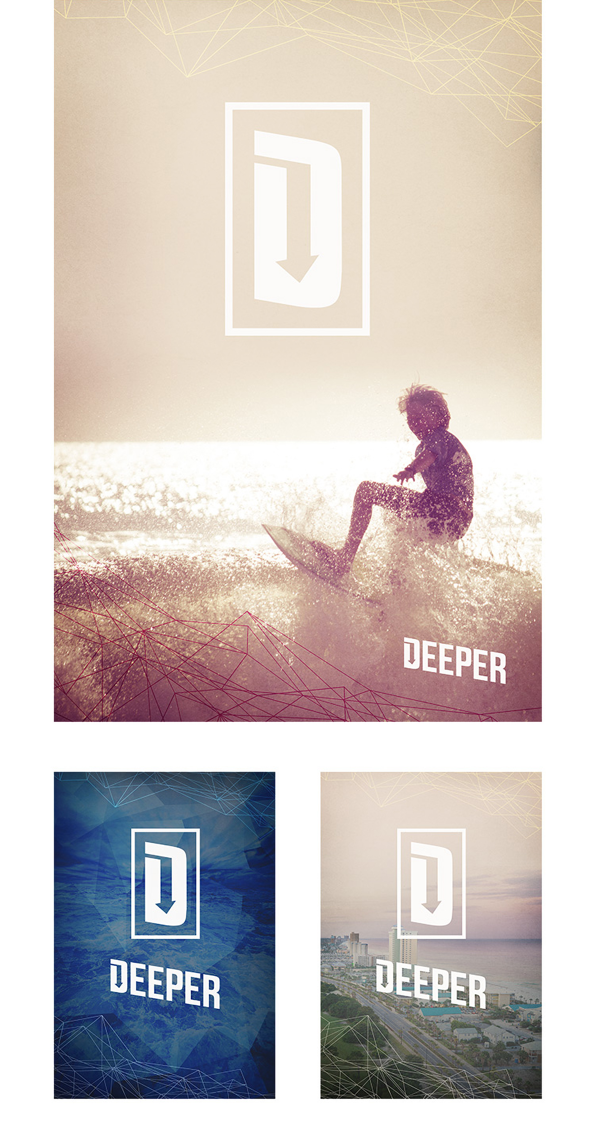
To the right are examples of the logo lockups, as well as a few examples of the supporting collateral.